Overview
Context: Arrow Respiratory is a healthcare provider specializing in sleep and respiratory therapy. Their existing website presented significant challenges: patients struggled with a confusing and jargon-heavy booking process, providers found it difficult to locate and order equipment, and the overall design lacked the trust signals expected in a healthcare setting.
Role: UX Designer ( research, ideation, prototyping, brand identity)
Tools: Figma, FigJam, Affinity Designer, Photoshop.
Research and Analysis
I began with a heuristic review of the existing site, evaluating navigation, content hierarchy, readability, accessibility, and overall visual clarity. The audit revealed a weak value proposition, hidden or vague calls to action, and a homepage that failed to guide users above the fold. Typography and color contrast were poor, which made the content hard to read, and the catalogue was cluttered with filters that were difficult to use.
To bring focus to the redesign, I created proto-personas to represent the main audiences. Mary, a sixty-two-year-old patient, needs a booking process that is simple, reassuring, and easy to understand. Dr. Lee, a forty-five-year-old provider, requires a catalogue that allows fast ordering and immediate access to compliance documents. Alex, a thirty-five-year-old caregiver, values plain language, clear education, and visible trust signals. Competitor sites such as BetterNight and VitalAire were also studied to benchmark best practices and set design standards
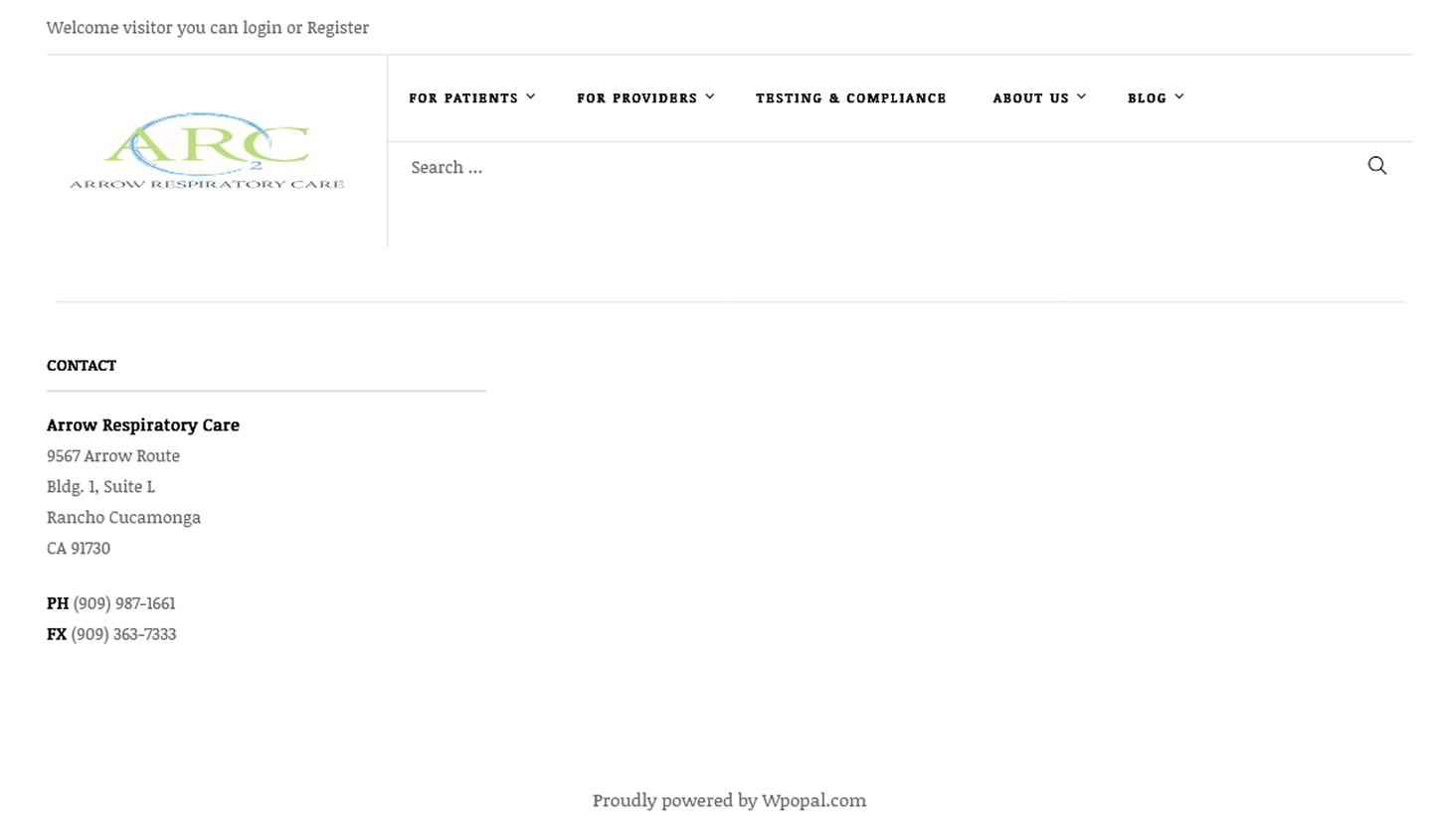
The original Arrow Respiratory website lacked clear calls to action, had small text and low contrast, and did not guide users toward booking or ordering equipment.
Problem Statement and Goals
The existing site made it difficult for patients to complete bookings, left providers struggling to access and order equipment, and did not project the sense of trust essential in healthcare. The goal of the redesign was to simplify the patient booking flow, reorganize the catalogue for greater efficiency, establish consistent calls to action, and strengthen trust with a modern, accessible interface.
Because this was a concept project, there was no live traffic or user analytics to measure. Instead, I defined future success criteria hypothetically, such as faster booking completion, smoother catalogue navigation, fewer abandoned flows, and stronger user confidence in the site
Ideation and Wireframes
I explored homepage layouts that placed the primary call to action front and center, created space for a patient story, and clarified the two main pathways: booking a test or browsing equipment. Wireframes were built to illustrate these flows, with patient booking broken into a clear three-step journey and provider ordering supported by filters, search, and quick access to documents.
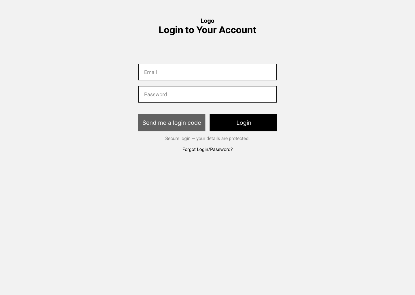
Patient Sleep Test Booking Flow
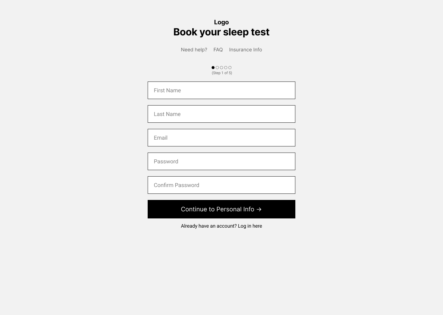
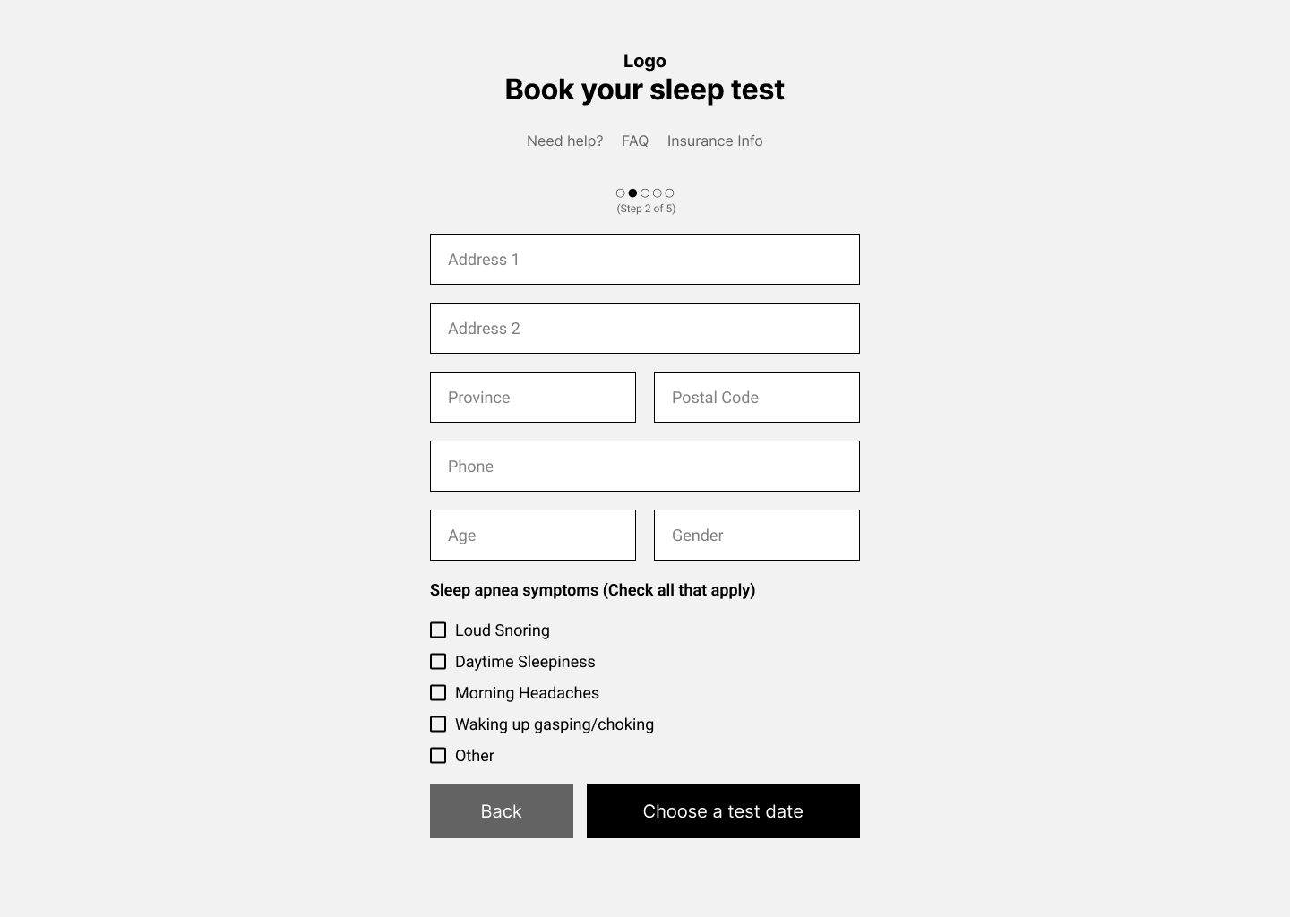
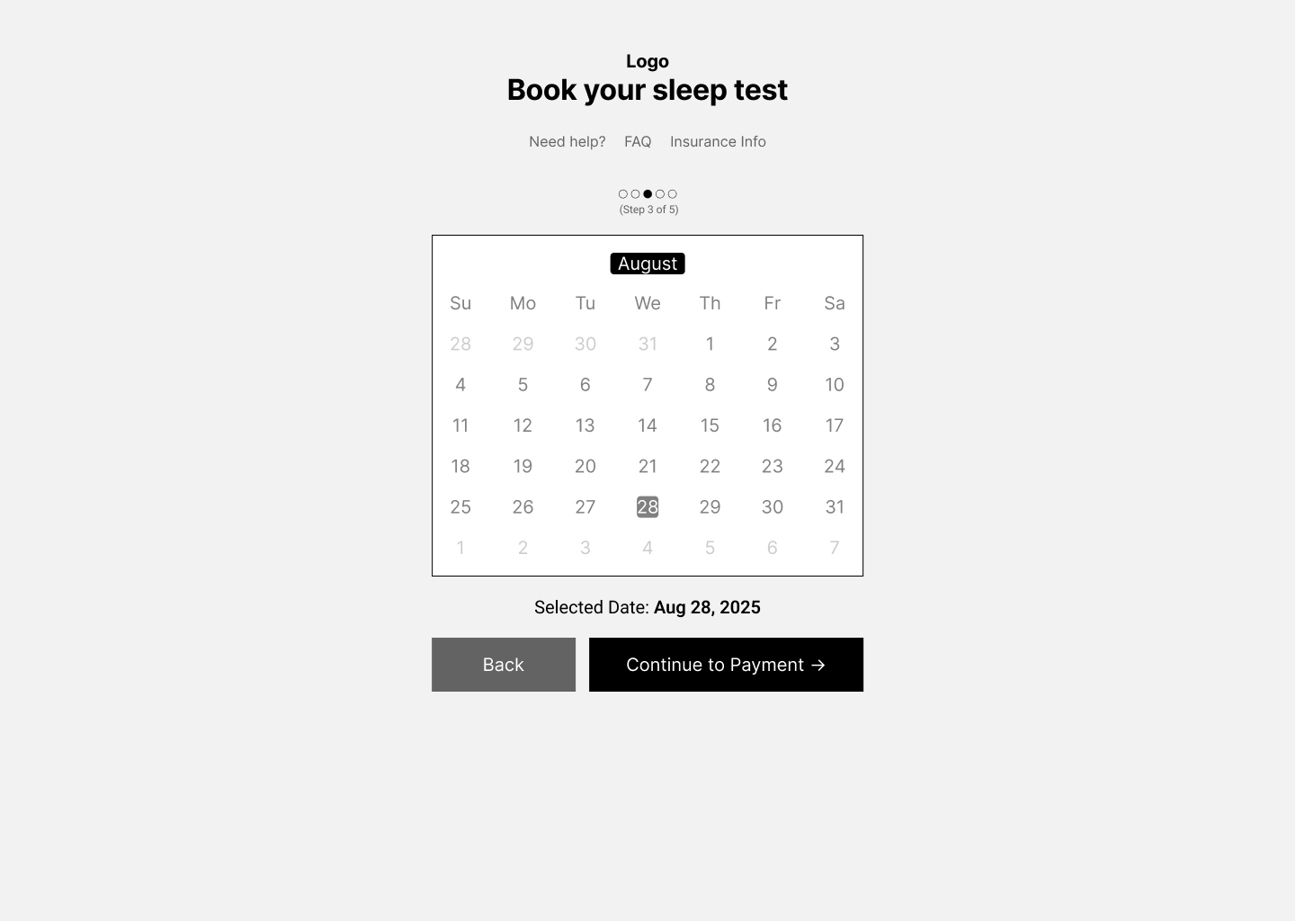
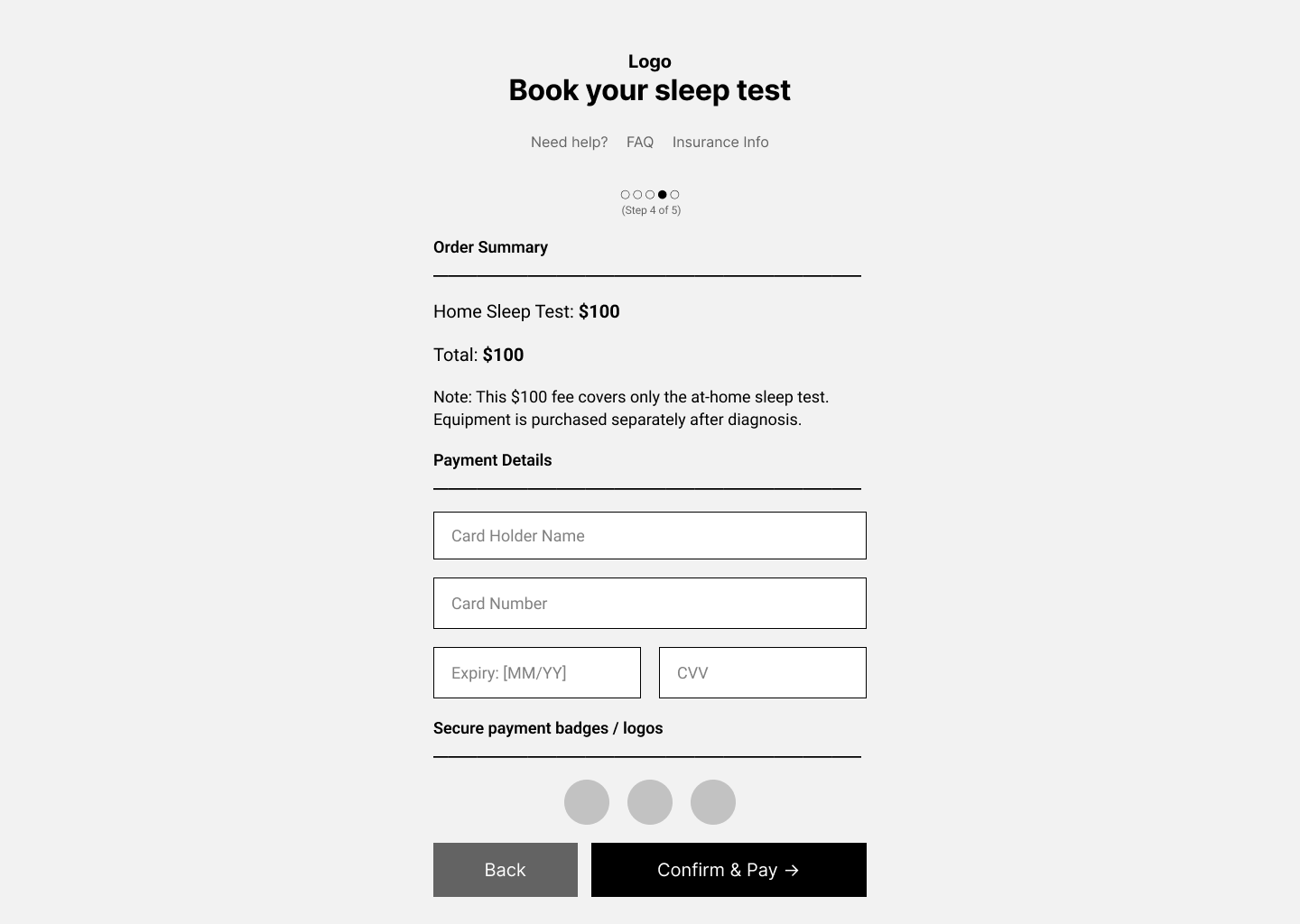
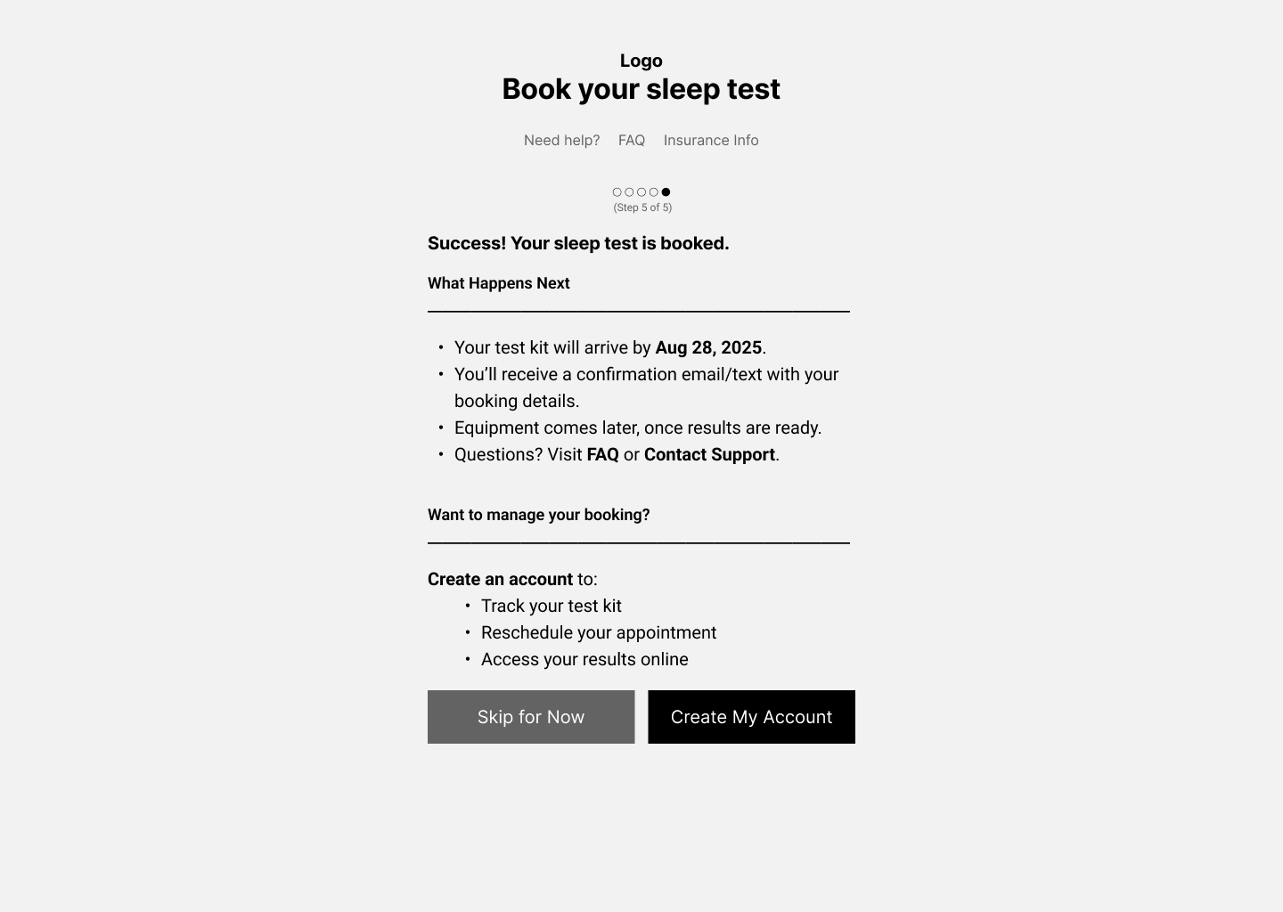
Wireframe of the patient sleep test booking flow, exploring how to simplify steps and improve accessibility
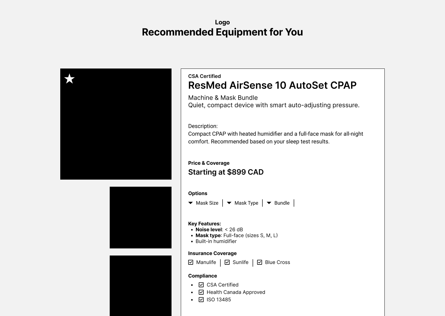
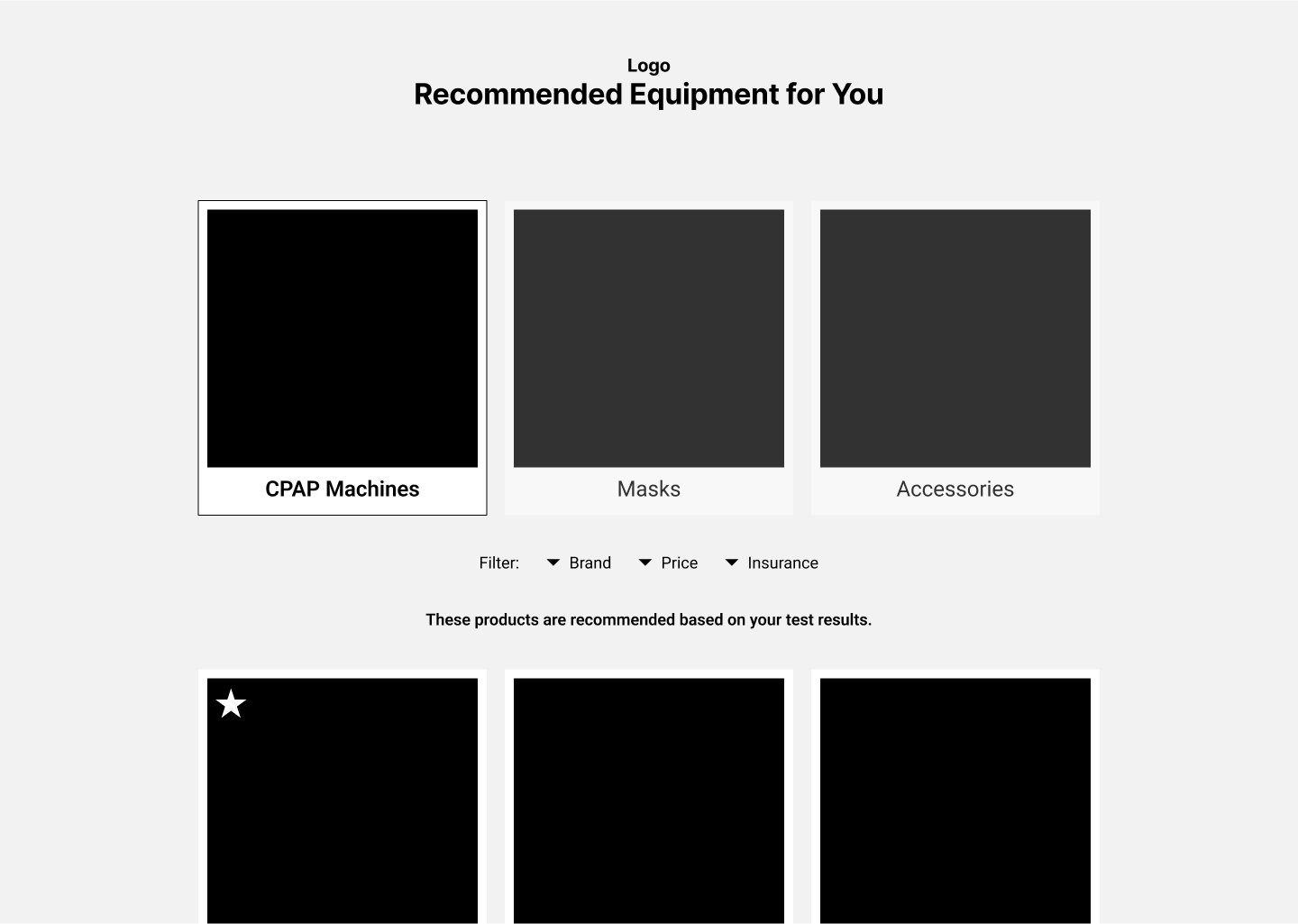
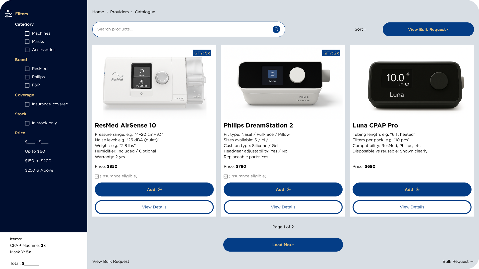
Provider Catalogue Flow
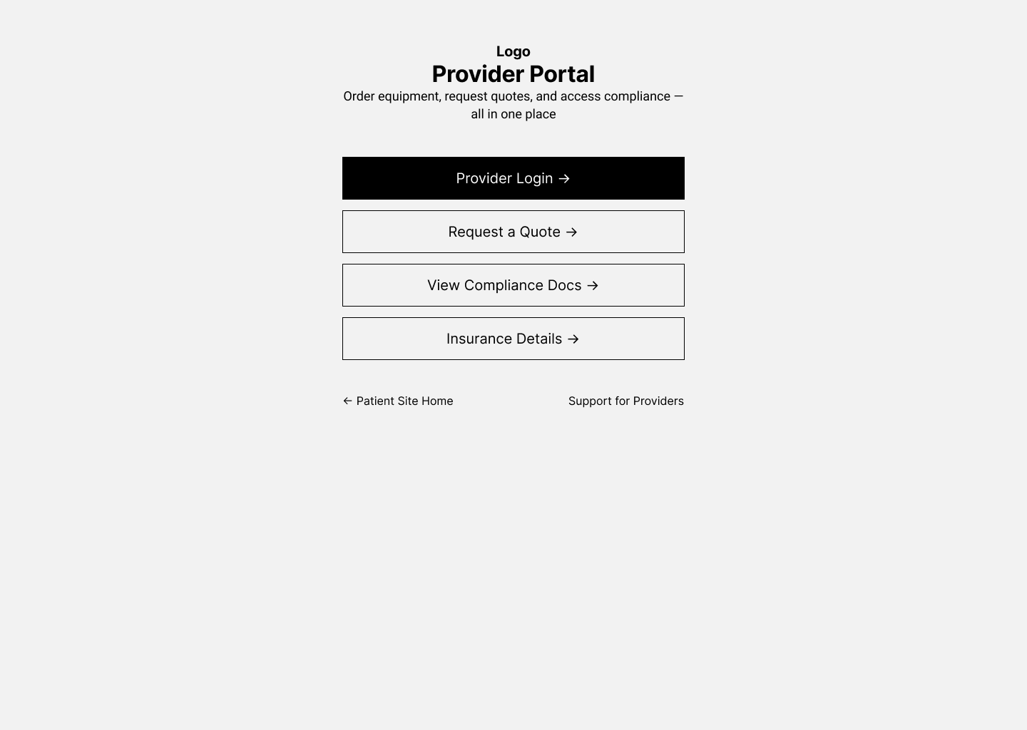
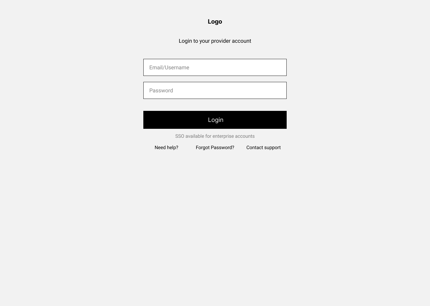
Wireframe of the provider catalogue flow, designed to streamline equipment browsing and make compliance documents easier to access.
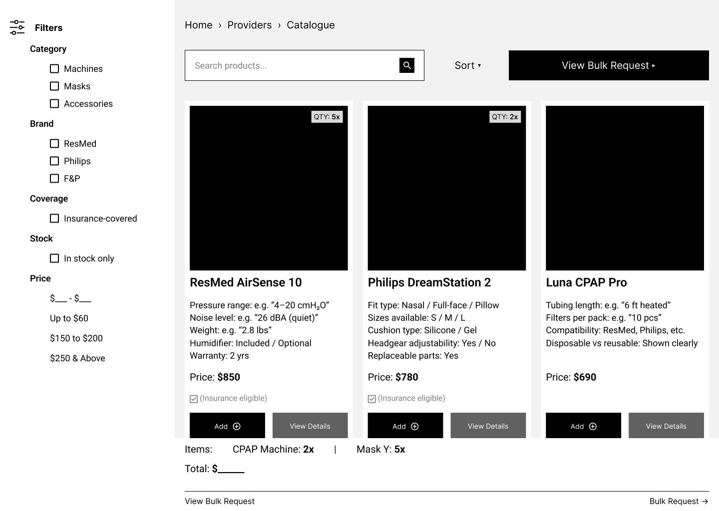
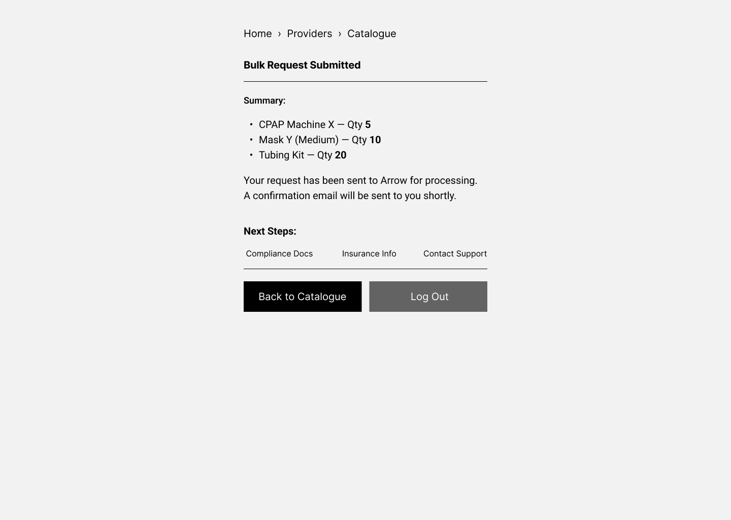
Product Purchase Flow
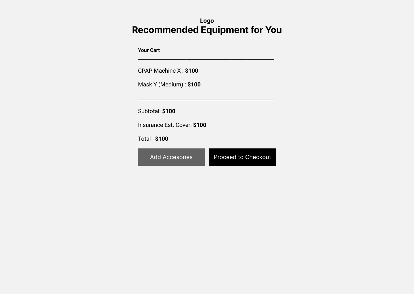
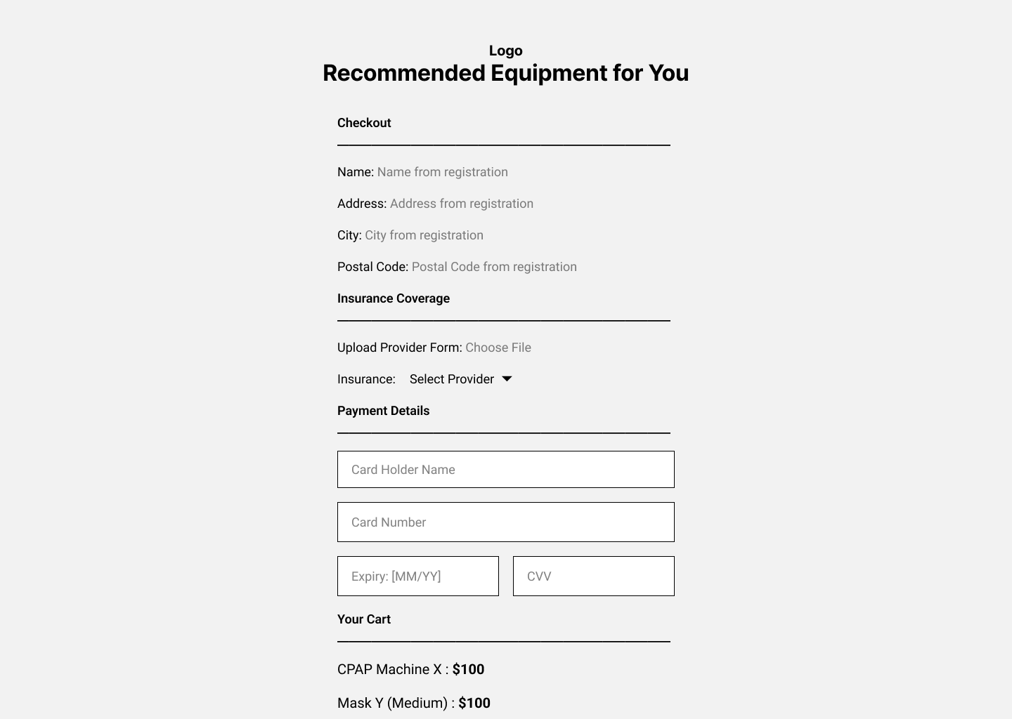
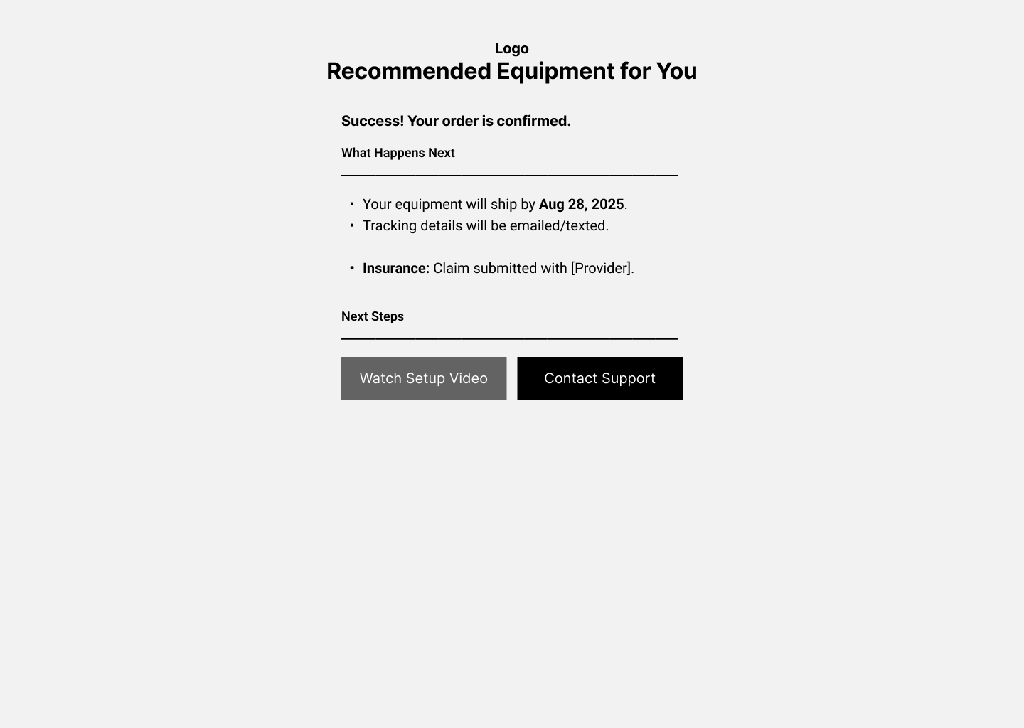
Wireframe of the product purchase flow, focusing on clear navigation, simplified ordering steps, and quick access to essential details
Prototype
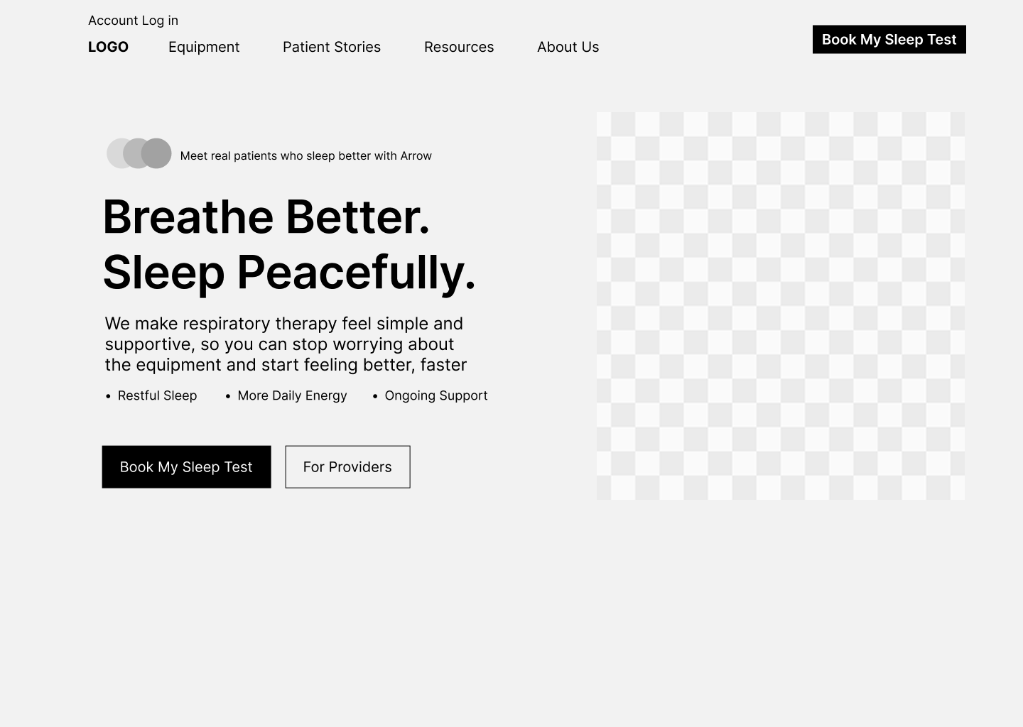
At this stage, I explored possible improvements through a user flow diagram and a high-fidelity homepage mockup. These mock explorations focused on how a clearer hierarchy, simplified steps, and refreshed visuals could make the booking process feel more intuitive and reassuring for patients, while also improving clarity for providers.
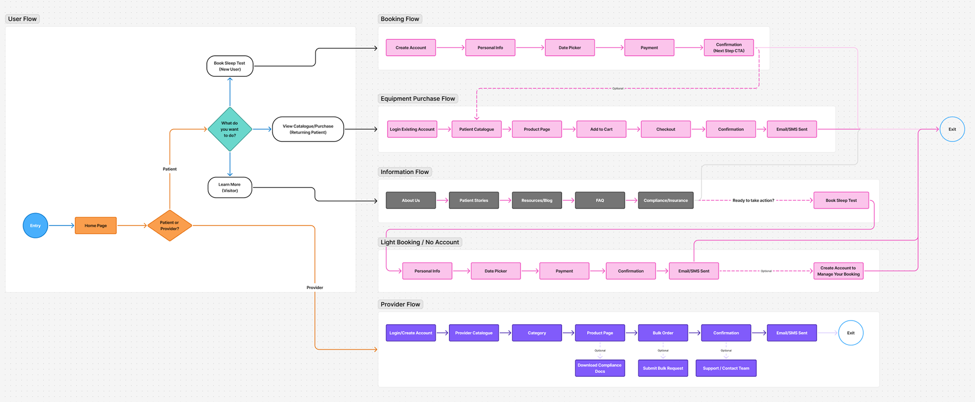

Comparison grid showing the redesigned high-fidelity homepage alongside the current website, with the new patient booking user flow placed below to illustrate the conceptual improvements in clarity and navigation.
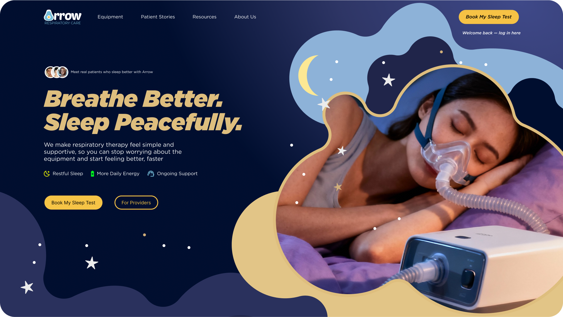
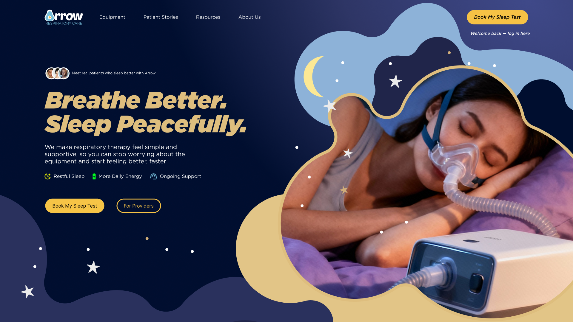
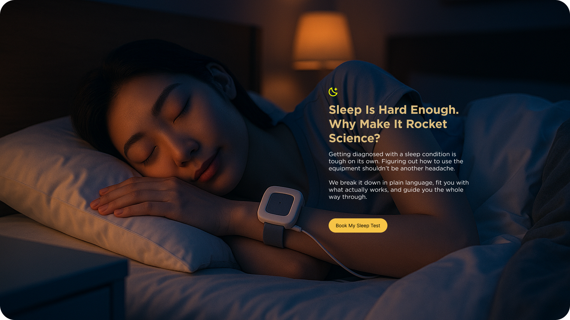
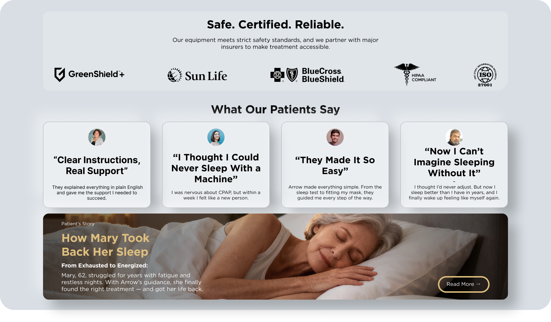
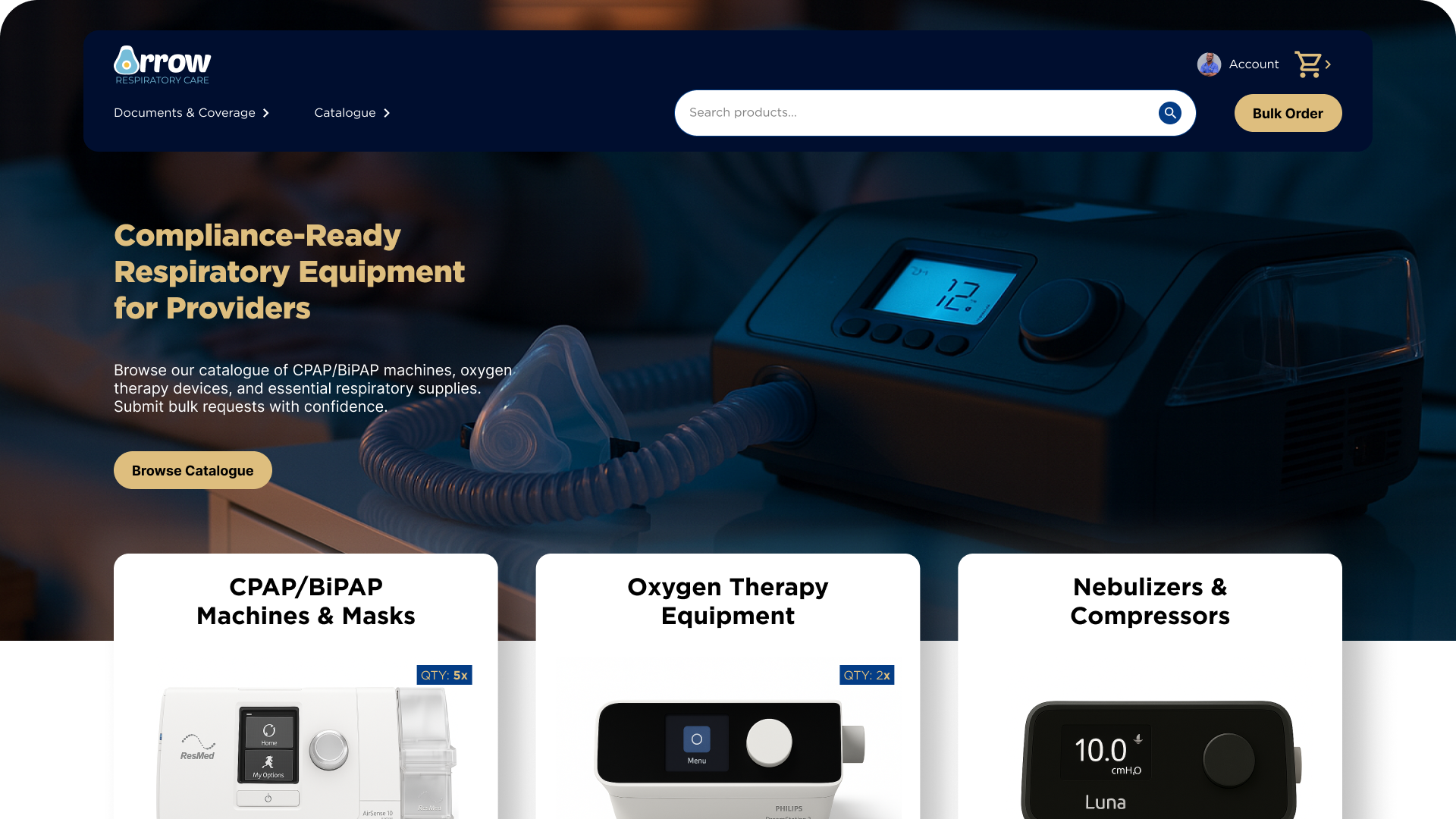
Proposed Redesign
The proposed redesign explores two distinct entry points, one for patients and one for providers, each tailored to their needs. The homepage highlights a bold value proposition, a clear next step, and visible trust signals such as certifications and testimonials. The catalogue is reorganized with persistent filters and consistent layouts, while the patient booking flow is simplified into three steps. These mock explorations aim to communicate clarity, accessibility, and trust.

Planned Testing
Although this was a coursework concept and not a live client project, I identified metrics that would guide validation if testing were to be carried out. These include completion rates for patient bookings, time on task for finding equipment, error rates in forms, and qualitative feedback on clarity and trust. Accessibility checks, such as screen reader compatibility and mobile responsiveness, would also be important in real-world evaluation.
Reflection and Next Steps
This project emphasized the importance of clarity in hierarchy and the role of visible feedback in building trust. Even small design choices such as the size and placement of call-to-action buttons or the visibility of confirmation messages can have a significant impact on usability. I also saw how accessibility considerations such as type size and contrast directly influence credibility in healthcare. As a concept project, the next steps would involve validating these assumptions with actual patients and providers, refining flows for mobile use, and expanding the site with features such as patient stories, testimonials, and multilingual support.
Thank you for reading.